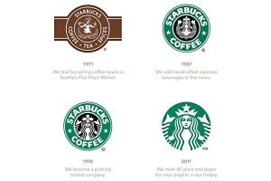
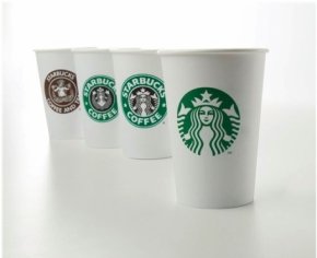
A $4 for cup of coffee has turned around the coffee business in the world, and yes it’s Starbucks. The brand has  strived to be the third best place for human beings after their home, and office. Over a period of 40 years, the evolution of the company has seen four logo changes in each decade that started in the year 1987. The first logo was created in the year 1971 in brown, with a mermaid who was bare chest, and reflected the coffee culture of the brand. As the company’s expansion plan gained momentum in the year 1987, a greenish tinge was added to the logo with a morphed form to the mermaid or siren (as mentioned by Howard Schultz). In 1992, the company once again gave the siren a new look with a more stamped version which gelled well with the customers till date. As the brand celebrates its 40th year of formation this spring, a new logo in all green has made stories around the world.
As Howard Schultz Mentions it: “The new logo is a representation of customers and company’s love for coffee, it establishes relationship with the partners and also develops connection with the customers.”
The company prepares itself to a new beginning, which embraces and respects heritage, and connotes future plans, as Mr. Schultz puts it.
The rave reviews around the logo change for the world’s largest coffee company, has once again brought a similar question that haunts the marketing geeks, why change? When the logo represents a cult which Starbucks has established over four decades, logo change has not been a welcome move among the customers who are devout for the brand. Social media space has been full of negative and a few positive acceptances from around the world. Well, dropping the signature words “Starbucks Coffee” from the logo is being counted as a bad move by the brand as marketers have started to relate it to the disaster which GAP created last October by changing their logo.
As in his book “The Starbucks Experience” Mr. Joseph Michelle points out the strategies which Starbucks use to make it the best brand, Embracing resistance has been the key area for the brand to grow. I believe with this logo change the company is once again embracing resistance but this time it’s from its own favorite consumers.
There has been many iconic brands which have no signature words around the logo such as Nike, Apple, Mercedes, Volkswagen, Shell etc. to name a few and they have made such great impressions on our minds but the outcome of this move by Starbucks would definitely is a matter of discussion for the company, as it tries to sync itself by creating an iconic class for the siren. As Professor John Quelch at Harvard Business School puts it “The brand is now evolving to a point where the coffee association is too confining and restrictive.”
“We’ve always believed the best days of Starbucks are ahead of us. So we’re excited to share with you where we’re going.” Says Howard Schultz.
As a brand leader in the industry, joins the club of logo changing brands the outcome and strategy of the brand gains momentum as talk of the town. Let’s wish for the best that Starbucks could provide to the industry.
Image Courtesy: Google images
This was originally published on 22 January, 2011 on http://www.alokr.blogspot.com
About Alok Ranjan
Alok Ranjan is recognized among the Top 100 Innovative MarTech Leaders by World Marketing Congress & CMO Asia. He is a Marketing leader, Digital Evangelist, and Marketing Technologist. He enables organizations in transforming their buyer journey by aligning marketing and sales functions to business objectives for maximizing their brand outreach, strengthening thought leadership, and accelerating demand generation.


